EMBRACE COLOUR
Colour is a key component in your interior design tool kit. If you are able to tap into what colours you positively respond to and have the confidence to use them, they offer a cost effective way to make your home more personal.
If you are renovating, your money will be spent on base fixtures and fittings for your home regardless, so planning and managing their colours is a smart way to get the most bang for your buck.
BE CONFIDENT WITH COLOUR.
Colour is the place where our brain and the universe meet. (Paul Klee)
We’ve all heard plenty of ‘rules’ when it comes to colour. From my experience, here’s what I know to be true:
Rules based on what colours mean or how they make you feel can be ignored in favour of your own personal preference. It is absolutely true that colours affect us but not all in the same way. I’ve seen a bright yellow and fresh white room described as creating a cheerful atmosphere and sleek look but for some people, it may feel like living in a boiled egg.
The inherent physical properties of colour however – how they can change the appearance of a room or how they appear in relation to each other – are consistent and can be used to help shape the look and feel of your home. Just like a dress or a suit with a good cut and in a beautiful colour can highlight your best physical qualities, thoughtfully chosen colours, well placed in your home, can show off its finest features.
So how do we combine these two ideas? I see it as the difference between WHICH colour and HOW colour. Of course we start with WHY colour, so I’ll touch on that too.
WHICH COLOUR?
Dr Zena O’Connor PhD (my colour researcher and design practitioner hero) talks about the interface between colour and human perception being subject to a highly complex combination of individual difference (age, gender etc), cultural differences (some universal but overall widely varying), contextual factors (for example the surroundings or light levels), perceptual factors and temporal factors (such as trends).
Dr O’Connor cites a comprehensive research review for NASA (Wise et al. 1988) to provide evidence-based information for spacecraft interior design found that, “there are no hard-wired linkages between environmental colors and particular judgmental or emotional states”.
The overall approach to the colour palette for our home can justifiably then be a very individualised choice based on which colours we want to live amongst. The application of the palette (what colours go where) is where we can be guided by the optical effects that influence our impression of space.
For example, whether the colour red brings to mind love, communism, aggression or confidence will depend on where and how it is used as well as the mind of the individual. However, it does grab your attention regardless of what you think when you see it.
HOW COLOUR?
The same NASA study mentioned above, found that lighter colours make an interior feel more open and less small. Here are some other givens:
- Warm colours (red, orange, yellow) advance, cool colours (blue, blue green) recede. To my eye greens and purples will depend on the exact colour in question.

- Colours appear brighter against a grey background.
- A ceiling will appear slightly higher in a lighter colour, lower in a darker tone.
- Looking at a space full of high contrast (between colours as well as between tones and levels of intensity) causes our eyes to jump around in jerky movements when we take in the scene. Whether the contrast is stimulating or exhausting will depend on how much contrast, as well as the individual and the context.
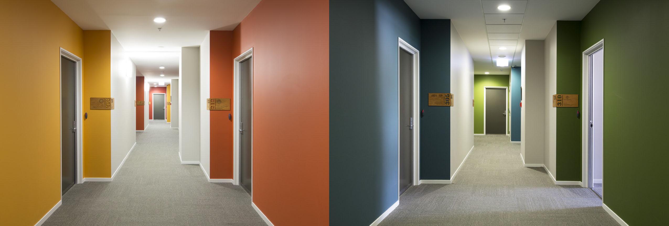
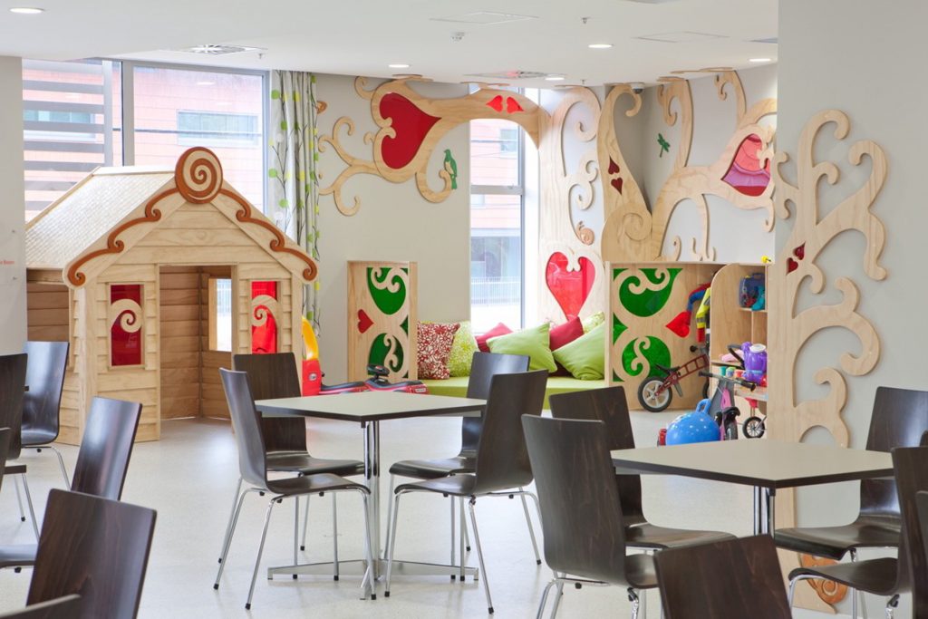
Red and green sit opposite each other on the colour wheel so contrast strongly, intended here to capture children’s attention and entice them into their play area at Ronald McDonald House.
If you want to create a restful sanctuary, WHICH colour you select will be one you personally feel is calming and HOW you apply that will be with a few other similar colours, with subtle contrast and minimal visual clutter through too much pattern or busy details.
If, on the other hand, you love the energy of highly saturated, bright colours, lots of pattern and bold contrast, think about where that would be most suitable to express, perhaps a hallway or other transitional space that is not intended for resting. An entry foyer that cheers ‘Welcome!’ as you enter might make you happy and why miss that opportunity because ‘on trend’ is pared back and neutral?
Finally, and just as important, is WHY Colour.
WHY COLOUR?
As with all design projects, be clear about your objectives. You are more likely to hit a clear target and all investments will be toward the same intended result. Who uses the space and when? For what purpose? What mood do you want to create?
SOME TIPS WHEN USING COLOUR.
- If you are not sure where to start with a new colour scheme, perhaps you have something you love the colours of – a ceramic, a piece of art or an article of clothing. If so, use it – someone has done the hard work for you! Within that piece be conscious of both the exact colours and the proportions each is used. It is in these subtleties that the magic is.
- Always look at the colour in the place you plan to use it, with the things you plan to use it with. For example, the colour of the floor and ceiling will reflect on the wall, so that pure white might look a lot more yellow when the timber floors are down.
- Colour is light. Light differs at different times of the day, in different parts of the room.
- Colours have a warmer or cooler appearance depending on whether the light is natural or artificial and, if artificial, if the lamp is halogen, incandescent, fluorescent and a ‘warm’ or ‘cool’ rating.
- Remember that you don’t experience a room in isolation so consider how colour
can be used to create both reassuring consistencies for the whole house and emphasise the distinction between spaces with different purposes. - Colours appear MUCH lighter outside and the distinction between shades may be less, especially relevant if you are aiming for a particular level of contrast between window trims and the base house. Also, bright hues appear more intense in daylight than in a shadowy inside corner, especially on a sunny day.
- Match the scale of your colour sample to the finished product. Rather than deciding the wall colour of a 25sqm room using a 2cm by 3cm colour chip, get at least an A4 drawdown to move around the room or, better still, a test pot.
- When working on an update, gather a collection of material samples (paint, tiles, timber, fabrics) and keep them handy as you go about making other choices. Our perception of colour is not only influenced by the colour itself but also by its texture and context amongst other colours. You can then avoid mistaken memory of a colour but also create the opportunity for finding happy surprises of complimentary or contrasting new materials.
- Be brave with colour! Another insight from Dr O’Connor is that, “Colour ‘humanises’ and encourages engagement”. A home of neutrals is perfect if it is a considered choice, but a shame if it is a fallback position due to a lack of confidence, because connecting with our interior spaces is a precious opportunity there for the taking. Most people instinctively know what they like, but if you’re still not sure (you know, that unobtrusive grey you painted your bedroom that now looks purple), do get expert help.
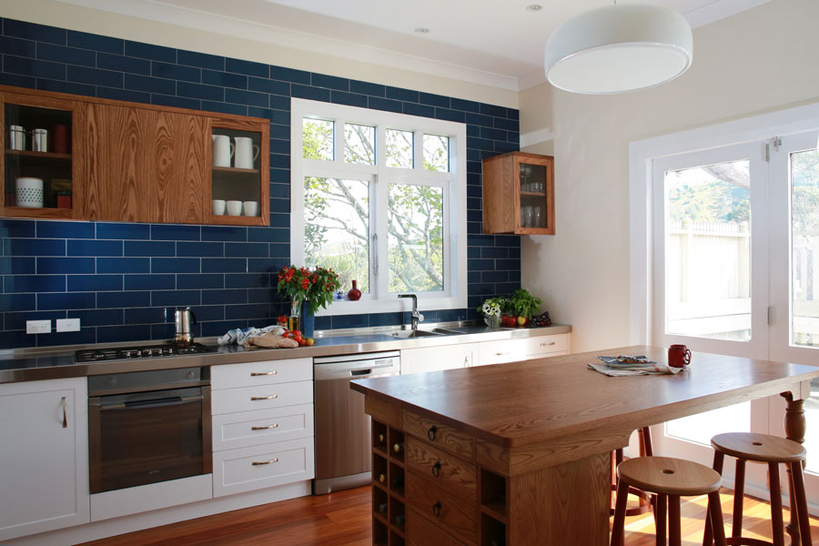
The full wall of blue tiles in this kitchen are bold, highlight the warm oak joinery and visually enlarge the space.
WANT TO KNOW MORE?
Check out Colour: Travels Through the Paintbox by Victoria Finlay. Part travelogue, part narrative history, this fascinating book unlocks the history of the colours of the rainbow and reveals how paints came to be invented, discovered, traded and used.
Dr Zena O’Connor has a PhD that investigated responses to colour, is an evidence-based colour consultant, designer, content creator, researcher and writer. Google her.
Dulux Colour NZ App allows you to capture colour, visualise spaces and browse their range.
Nature is a bountiful source of inspiration. The online Resene Colour Palette Generator allows you to upload or link to an image and suggests similar paint colours to your picture. How you apply this palette is then of course not limited to paint.