INTERIOR DESIGN PORTFOLIO: PROJECTS
Every project tells a story, reflecting the way our clients like to live, work & play & our commitment to interior design with intention & integrity
In our interior design portfolio, you’ll see a collection of residential & commercial spaces, each crafted to honour the space & the people within

Ohariu Valley Kitchen (residential)

Washington Ave Basement Bathroom (residential)

Wellington Villa Bathroom Renovation (residential)

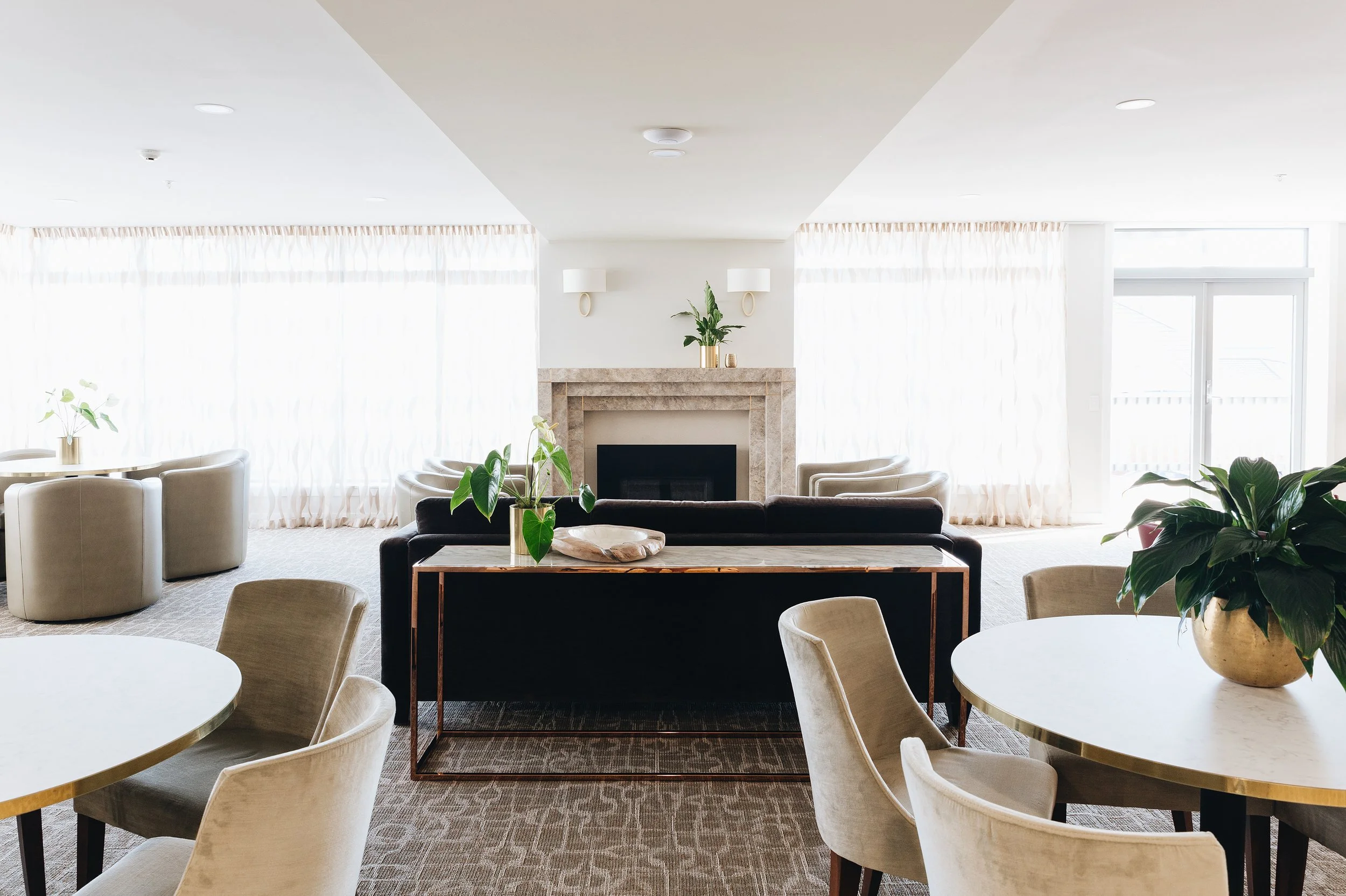
Woburn Masonic Care Interior Design (commercial)

Kaiwharawhara Views Home Renovation (residential)

Miramar Kitchen Makeover (residential)

Wainuiomata Masonic Village Communal Facility (commercial)

Eastbourne Green Family Bathroom (residential)

College Street Apartment Renovation (residential)

Plimmerton Ensuite Sanctuary (residential)

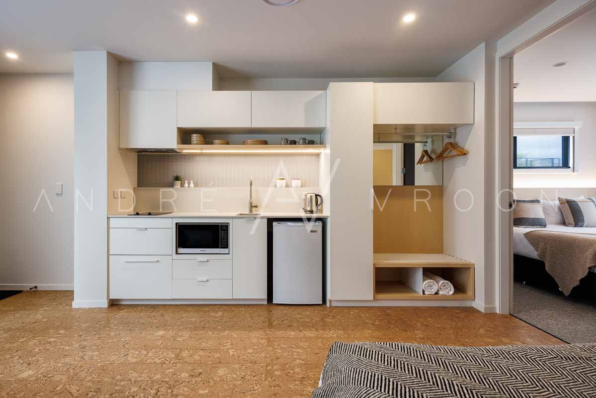
Woburn Apartments Interior Design (commercial)

NZCIS Athletes Village & Amenities Building (commercial)

Seatoun New Build Interior Design (residential)

Corporate Staff Wellness Room Design (commercial)

Point Chevalier Apartment Kitchen (residential)

Seatoun Heights Kitchen Renovation (residential)

Mt Victoria Townhouse Kitchen (residential)

Eastbourne Blue Bathroom Renovation (residential)

Wellington Hospital Patient Lounge (commercial)

Cuba Street Apartment Storage Design (residential)

Radium Office Interior Design (commercial)

Halswater Home Renovation (residential)

Brooklyn Villa Kitchen Renovation (residential)

Taita Library Interior Design (commercial)

Hataitai Villa Finishing Touches (residential)

Ronald McDonald House Interior Deisgn (commercial)

Thorndon Townhouse Kitchen (residential)

Inspired by what you see?
Let’s bring a vision to life that honours your space and the people within. Our interior design team is here to approach your project with the same care, depth and attention to detail you’ve seen here.


